Buried within the walls of London: 3386
Whereof the plague: 1
Buried outside the walls: 5924
Whereof the plague: 5
Buried in total: 9310
Whereof the plague: 6
This illustrates well that the essence of descriptive statistics is counting.
From all the parrish registers, he counted the number of persons who died, and
who died of the plague.
Because the numbers sometimes were rather too large to comprehend, He also simplified them. For the year 1625 which had 51758 deaths, of which 35417 were of the plague; he wrote: "we finde the Plague to bear unto the whole in proportion as 35 to 51. or 7 to 10." With these approximations, he is introducing the concept that relative proportions are sometimes of more interest than the raw numbers. We would generally express the above proportion as 70%.
As a first exercise in descriptive statistics, you should be able to construct a table showing the frequency (raw count) of various events, and also express the results as relative frequencies (percentages of the whole). Exercise:
In 1625 in Margarets Lothbury 114 persons died, of which 64 deaths were attributed to the plague; in Margarets Moses 37 persons died, of which 25 deaths were attributed to the plague; in Margarets new Fishstreet 123 persons died, of which 82 deaths were attributed to the plague; and in Margarets Pattons 77 persons died, of which 50 deaths were attributed to the plague. Present this information in a table, and represent it as relative frequencies.
Note that we have used the raw count data to calculate relative frequencies. If we only know the relative frequencies, we cannot calculate the raw count data (unless wee also know the total number of data).
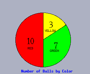
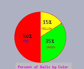
A graphical presentation is often easier to comprehend than a table. Bar charts and pie charts are the most common graphical presentations. We will illustrate these in the case one has 7 green balls, 10 red balls, and 3 yellow balls. The number of each type (i.e., 7, 10, 3) is called the frequency. Such information can be communicated graphically with a bar chart or pie chart as follows:
              10_         __
                         |  |
                         |  |
                    __   |  |
      number       |  |  |  |
        of     5_  |  |  |  |
       balls       |  |  |  |
                   |  |  |  |   __
                   |  |  |  |  |  |
                   |  |  |  |  |  |
                ___|__|__|__|__|__|___
                    G     R     Y

                   color of balls

                 Frequency of Ball Colors
Note that we may divide the number (frequency) of each type by the total number (in this case 7+10+3=20) to get the percent or relative frequency of each type. This information can also be displayed in a bar chart or histogram:
              50%_        __
                         |  |
                         |  |
                    __   |  |
      number       |  |  |  |
        of    25%_ |  |  |  |
       balls       |  |  |  |
                   |  |  |  |   __
                   |  |  |  |  |  |
                   |  |  |  |  |  |
                ___|__|__|__|__|__|___
                    G     R     Y

                   color of balls

           Relative Frequency of Ball Colors
Note that the frequency or relative frequency of any sort of characteristic can be displayed with a bar or pie chart. Note also that some information which is not count information (such as miles per gallon of different cars) can be displayed as a bar chart, but cannot be displayed as a pie chart since the information is not parts of a whole. Pie charts are only appropriate when data can be interpreted as parts of a whole.
                          __
                         |  |
               20_  __   |  |
      MPG          |  |  |  |   __
                   |  |  |  |  |  |
                   |  |  |  |  |  |
                ___|__|__|__|__|__|___
                    GM    BMW  Ford

                   Make of car
Exercise:
Represent the moratality data for the Margarets parishes with bar charts and pie
charts; present some information which can be displayed with a bar chart, but
not a pie chart.
Competency: Represent the data set {CJJMCJMMJCMMM} of the religion
(Christian, Muslim, Jewish) of 13 people interviewed in Jeruselem with both a
bar chart and a pie chart; label them with both absolute and relative
frequencies.
Identify some information that could be displayed with a bar chart, but not a
pie chart.
Reflection: What are all the decisions which you must make in order to
represent a data set with a bar chart or pie chart?
What are the advantages and disadvantages of a bar chart versus pie chart?
Challenge: If you had the per capita income of the New England states, how could you modify that information to represent it in a pie chart?
13 May 2003
campbell@math.uni.edu