Summarizing a set of student weights
Consider the 18 weights of students taken from the DASL library
   188.5   183.0   194.0   185.0   214.0   203.5   186.0   178.5   109.0
   186.0   184.5   204.0   184.5   195.5   202.5   174.0   183.0   109.5
The nature of the distribution of the weights may not be immediately obvious. Using the DESCRIBE command in Minitab
Descriptive Statistics


Variable             N       Mean     Median     TrMean      StDev    SE Mean
C1                  18     181.39     185.50     183.88      28.15       6.63

Variable       Minimum    Maximum         Q1         Q3
C1              109.00     214.00     181.87     197.25
shows that the data is skewed to the left because the mean is less than the median, there are some extreme values because the trimmed mean is not equal to the mean, and it might be noticed that the minimum is much further from the first quartile than the maximum is from the third quartile. Still, it is hard to comprehend the essence of the data from the summary statistics. The
stem-and-leaf shows all the data organized in a manner in which it can be comprehended, but may entail overkill from all the information that is provided, and may take up too much space.
Character Stem-and-Leaf Display


Stem-and-leaf of C1        N  = 18
Leaf Unit = 1.0


    2   10 99
    2   11
    2   12
    2   13
    2   14
    2   15
    2   16
    4   17 48
   (8)  18 33445668
    6   19 45
    4   20 234
    1   21 4
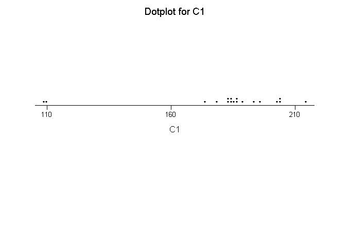
The dotplot provides essentially the same information as the stem-and-leaf plot, but with greater visual appeal and less specific information.
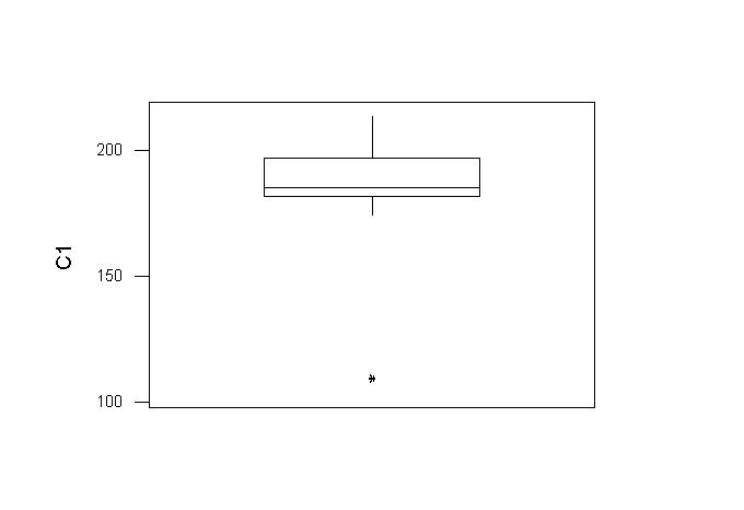
 The boxplot organizes the information in the summary statistics and presents it visually. One can see the range of most of the data, and that there is an extreme individual (or individuals) to the left (bottom as displayed). However, one must be familiar with boxplots to comprehend the information, and there are variations in how boxplots deal with extreme individuals.
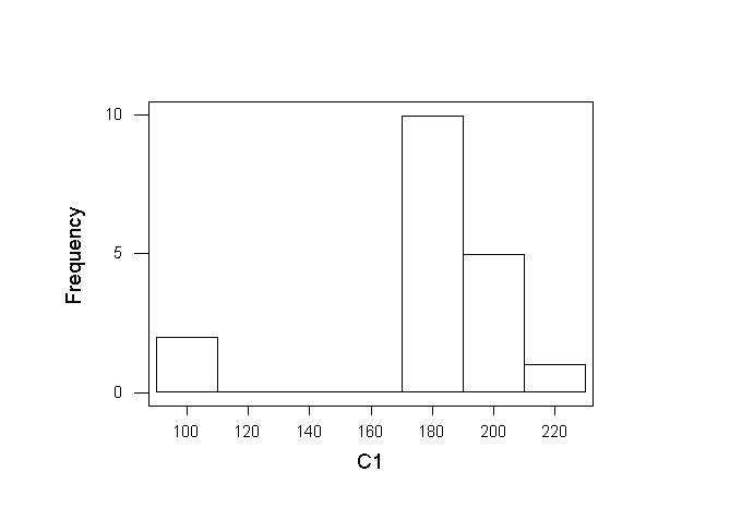
 I think that the best visual display of this data is with a histogram. Specific information is missing, but one can immediately comprehend the nature of the distribution.
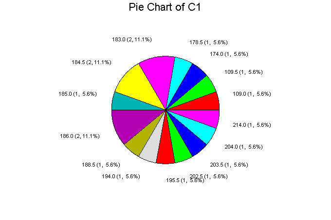
 The piechart minimally incorporates the quantitative nature of the data, hence gives little indication of the nature of the distribution.